Revera
(The music place)
(The music place)
Revera is a music-learning app that helps teenagers learn instruments easily and enjoyably. It offers fun lessons, a 30-day challenge, offline learning, and quick access to musical facts, all designed to make learning music simple and engaging.
Role : UI/UX Designer | Timeline : 3 weeks | Tools : Figma
Teenagers who want to learn how to play musical instruments struggle to access engaging and affordable tutorials. Most online videos feel boring or too complex, and the high cost of data makes consistent learning difficult.
To make learning music simple, exciting, and accessible for teenagers by offering interactive lessons, fun challenges, and low-data or offline learning options.
Name : Teni
Age : 17
Goal : To learn how to play musical instruments and create simple songs
Frustrations :
1 . Online tutorial ar boring and confusing.
2 . High data cost makes consistent learning difficult.
3 . feels unmotivated to continue without structure or guidance.
Needs :
1 . A fun, flexible, and affordable way to learn.
2 . Offline and low-data modes
3 . Motivation through challenges and progress tracking.
Pain Point: Finds most online music tutorials boring and expensive to access.
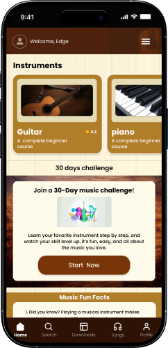
How Revera Helps: Introduces engaging, level-based lessons with fun visuals and easy navigation for beginners.
Pain Point: Struggles to stay consistent and quickly runs out of data.
How Revera Helps: Offers both offline theory and low-data video lessons to support continuous practice anywhere.
Pain Point: Feels unmotivated and unsure of progress.
How Revera Helps: Encourages commitment through 30-day challenges, progress tracking, and fun facts that keep learning exciting.
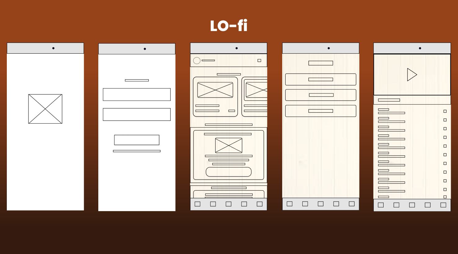
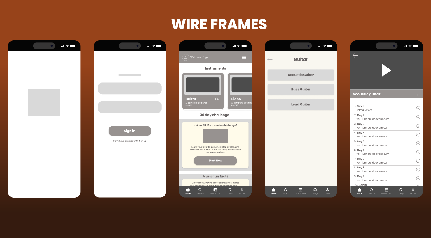
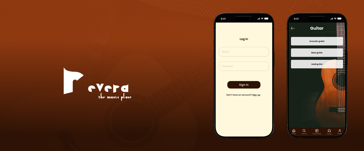
THE FINAL SCREENS

Splash screen

Onboarding
Log in page
Home page
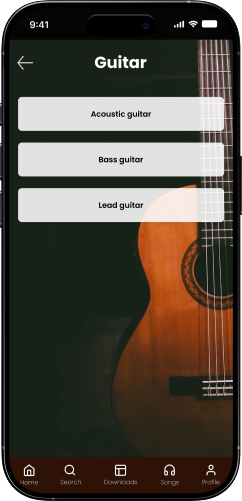
Instrument categories
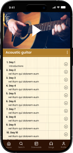
learning page

I added several ideas that made the app confusing. Simplifying helped users focus on learning.
The first version felt too formal. Adding the 30-day challenge and fun facts made learning enjoyable.
I used too many colors at first; creating a simple style guide fixed that.
Working on Revera taught me how crucial motivation is in product design, especially for young users. It wasn’t just about building an app that teaches music; it was about creating an experience that keeps teenagers curious, consistent, and proud of their progress. This project helped me strengthen my UI storytelling and user empathy skills.
For more work inquiries, or to grab a coffee do email me at olayinks97@gmail.com
Thank you for reading! ❤
Scroll To The Top :